Week 10: Type and Page
- Ashley Ehman
- Dec 2, 2020
- 10 min read

Updated: Dec 10, 2020
This week is all about type! From kerning to the x-height, the materials from the course cover how different typefaces can convey different meanings, legibility, readability, and the history of type as a whole. How can we as designers use type to further the message of our designs?
Lecture Reflection
The lecture, led by Kristoffer Soelling, was a great starting point to dive into the world of typography with. He covered the various elements that go into a typeface, including leading, kerning, x-height, whether it has serifs or not, and how long the descenders and ascenders reach. Soelling also made a point to cover the basic history of typography, which led me to do some research beyond the lecture itself.
As Soelling introduced Johannes Gutenberg, who I believed to be the original creator of movable type, he said something rather unexpected. Soelling explained,
That’s not entirely true, because the idea of movable blocks, movable printing blocks, was not first thought up by Johannes Gutenberg, but for the sake of our argument in the west, or regarding the Latin alphabet, we can say he invented the idea of movable type (Falmouth Flexible 2020).
Even my "Introduction to Typography" course in my undergraduate studies had never mentioned that movable type was not actually created by Gutenberg. History always seemed to create a false picture that the Gutenberg bible was the first print of its kind.
With this new knowledge in tow, I began to dig a bit further. If it wasn't Johannes Gutenberg who came up with this idea, who did? It turns out that the answer could be found in China, not Germany like I had originally been taught. Pi Sheng, a Chinese alchemist, invented movable type in 1041. His process expanded upon carved printing blocks, by mixing glue and clay together. When the clay was warmed, they would settle into place. This made it so the type was aligned and structured when the resin and ink were added. When printers were done with a line of text, they would heat the clay up again, which allowed the separate pieces to be removed and reused.
The advent of movable type brought about expanded knowledge exchange, as books became more easily mass-produced. In addition, playing cards and paper money became a reality. Beyond books, movable type was also used to distribute information, like local laws, recent news, and knowledge about other cultures.
Resource Reflection
The resources for this week were exceptionally verbose and I found myself reading them over a few different times. While both were useful in the context of this week's materials, I found myself engaging more with the Phil Baines chapter on Structure from his book, "Type &Typography."
Baines presented a number of things to consider when designing with type. There were a few that I had considered previously, but quite a few were new to me. As such, I've decided to outline them below. With our Studio Practice PDF deadline getting closer, I thought it would be beneficial to further examine what Baines had to say.
According to Baines, a designer needs to make ten different decisions when designing with type. They are as follows:
Typeface
Choosing a typeface is one of the most important choices you'll make in a text-based design. It's important to consider how legible the font is, as well as its readability. Beyond that, one needs to grasp what feeling their words are trying to convey, and choose a font that matches that. For example, something whimsical might use a swirly font, such as Darleston. On the other hand, a more serious piece might do best in a Baskerville font.
Type Size
The size you choose to use is most often influenced by the medium in which you're designing for. Magazines and adult novels will typically have smaller type sizes since there's more content to fit into a smaller space. Other designs, such as billboard graphics, will have to consider things like how far away their audience will be when they see it. Size isn't all about being able to read the text, however. Type size can also be used to emphasize a certain word or draw a reader in.
Color
There are many different considerations when it comes to color and type. First, is the color meant for the text itself or the background the text will be on? If you're putting together a piece with lots of continuous body text, black is likely the best choice. Aside from legibility, color can be used to portray excitement, text hierarchy, or place emphasis on a given word.
Line Length and Horizontal Space
The four main elements of word spacing are:
Line length
As the name suggests, this is how long the line is. This is the distance between the left and right edges of the text block.
Kerning
Kerning is the space between individual letters in a word.
Tracking
Similar to kerning, tracking is the uniform spacing across a range of characters.
Word space
The space between each word.
Leading
Similar to the other items above, leading is the term given to the amount of space between each line of text.
The categories above are (in my opinion) the four most important things to pay attention to when designing with text. Baines also considers the implications of certain design decisions when looking at text alignment, paragraph articulations, column depth, how the text is positioned on a page, and the format you're designing for. Moving forward with this week's Workshop Challenge, I fully anticipate considering the implications of each decision in my final piece.
Workshop Challenge
Prep
Getting ready for this Workshop Challenge actually proved to be the difficult part this week. We were tasked with making a text-based design of a national poet or author's work. For most, I would imagine this would be an easy task. However, I have a large collection of poetry in my personal library, and choosing just one poet was not an easy task.
Some of the contenders were:
Shel Silverstein
Amanda Lovelace
Neil Hilborn
Rupi Kaur
The anonymous individual behind "Diary of an Oxygen Thief"
In the end, I chose to work with something out of Rupi Kaur's "Milk and Honey" chapbook. Her poetry has always connected with me and having seen her in a public reading a few years ago, I felt I was better tasked to capture her voice in my design.
With my poet and book chosen, the task of choosing which poem to work with took up a fair bit of my time. For those that are unfamiliar with the book, "Milk and Honey" is broken up into four parts: the hurting; the loving; the breaking; and the healing. I opted to forego any of the poems in the "the hurting" section, simply because they can be a bit graphic in nature and I didn't want to work with that content. In the end, my shortlist of poems all came from "the breaking" and "the healing" sections.
My top three choices were:
"i am losing parts of you like i lose eyelashes // unknowingly and everywhere" (Kaur 2018)
"most importantly love // like it's the only thing you know how // at the end of the day all this // means nothing // this page // where you're sitting // your degree // your job // the money // nothing even matters // except love and human connection // who you loved // and how deeply you loved them // how you touched the people around you // and how much you gave them" (Kaur 2018)
"your art // is not about how many people // like your work // your art // is about // if your heart likes your work // if your soul likes your work // it's about how honest // you are with yourself // and you // must never // trade honesty // for relatability" (Kaur 2018)
I ended up choosing the second poem. The others would have been fun to work with and had nice messages, but the second one has always been one of my favorites. Even now, five years after "Milk and Honey" came out, this is still one of my Top 5 Favorite poems.
Research
With my piece chosen, I had to figure out what sort of direction I was going to take with my design. I began by looking at a variety of different expressive type pieces and found a few that were particularly interesting.
House of Leaves
Written by Mark Z. Danielewski, "House of Leaves" is a story about "a young family that moves into a small home on Ash Tree Lane where they discover something is terribly wrong: their house is bigger on the inside than it is on the outside" (Danielewski 2000). It's not the story that makes this book so interesting, however.
The inside of the book reveals pages upon pages of broken, almost moving text. There are no fixed margins, and it hardly reads like a normal book. In fact, "the novel quickly gained a cult following, and was praised for its experiments with typography, labyrinthine design and strange story" (Lloyd 2020).

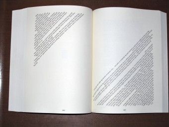


These are just a few of the pages that can be seen within the book. I liked how Danielewski took the liberty of bending his text in as many ways as it seems he could find. No two pages in the book look the same, and I found it inspiring to see how his out-of-the-box thinking became a novel.
Club Dada
Dadaism came up quite frequently in my research and I found myself drawn to the art style. This art movement, or more aptly anti-art movement, was a result of World War I. During this time, artists were "reacting against the rise of capitalist culture, the war, and the concurrent degradation of art" (Artland Magazine 2017). It was a direct result of the worldly atrocities being faced around the globe during the war. As the Museum of Modern Art explains,
Dadaists unleashed an arsenal of puns, wordplay, and experimental poetry and literature...to free text and speech from conventional rules of spelling, grammar, and punctuation (MoMA 2019).
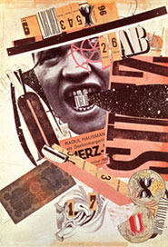
Rauol Hausmann
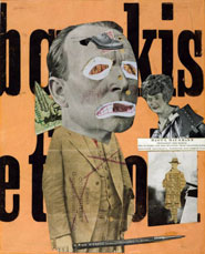
Out of the many dadaists that I looked at, I was most drawn to the work of Rauol Hausmann. A number of his works included text, as well as imagery, and I liked the way he combined things into one cohesive piece. He worked with photomontages and collages. A photomontage is when more than one image is made into a single photograph through manipulation. A collage is when individual pieces come together on a single surface. I liked the idea of both, but opted for a more collage-esque approach to my project.


Process
Dadaism thrives on going against the expected norms for imagery, text, sculpture, or whatever other medium one is working with. It comes from a place of disgust towards the world, which is why I chose the poem I did. Rupi Kaur's voice in the poem I chose resembles a certain level of desperation and pleading. She is begging the world to embrace love and forget about all the other things that people are so worried about nowadays.
With an artistic direction in mind and a piece to work with, I settled in to start designing. I started by breaking the lines of the poem into different pieces. Some of the lines stayed as they were, others were separated. Initially, I placed everything in my InDesign document as one kind of font, so that I could organize things in a general fashion before completely messing with their structure.

I sorted out which pieces I wanted to work together, put together a very loose placement of where each phrase would be, and then started to experiment with font and size. At first, I chose fonts that I liked, but as the words began to take shape, it was easier for me to pick out which fonts would work together better than others. I focused on having nearly every piece of the poem in a different font than the rest, and worked out sizing to emphasize certain bits or draw attention away from other parts.

In my original rendition, a lot of the text remained in a flat alignment. I knew I wanted to change this. In addition, I added a paper bag texture to the background as a nod to how original Dada artists would have worked with physical materials, such as paper. I continued by adding some images and incorporating a cut out appearance to some of the lines. I was looking to design something along the same lines as a collage, like the one Raoul Hausmann did.

Despite having what looked like a finished piece, I wasn't satisfied. The list of things that Kaur has in her poem needed more impact, so I changed them to all different fonts. I played with some kerning in the word "touched" to further the impact of the word. I also added other elements of bolding, underlining, and spacing. My final piece is below.

Update: Post-Crit #3
Yet again, the background was a point of contention for this piece during the third critical review. My partners suggested that I take the paper texture out, and leave the background blank. I will admit it looks crisper with the tan color removed. Overall, I think the decision to remove it makes the piece stronger.

Final Thoughts
I'm satisfied with the final look of this project. If I had the resources, I would love to see it printed out in all its 11x17 glory. I would also play with adding more imagery, in order to create a more chaotic piece. However, I was afraid of doing so with this one, as I still wanted the poem to be legible and the message to be portrayed effectively.
Sources:
ARTLAND MAGAZINE. 2017. “What Is Dadaism, Dada Art, or a Dadaist? [Complete Guide 2019].” Artland Magazine [online]. Available at: https://magazine.artland.com/what-is-dadaism/ [accessed 25 Nov 2020].
DANIELEWSKI, Mark. 2000. House of Leaves. bookshop.org. Turtleback Books. Available at: https://bookshop.org/books/8494487/9781417709045 [accessed 1 Dec 2020].
FALMOUTH FLEXIBLE. 2020. “Form and Function with Susanna Edwards and Sam Winston.” flex.falmouth.ac.uk [online]. Available at: https://flex.falmouth.ac.uk?wvideo=d0v0z1z0gk [accessed 25 Nov 2020].
GRESZES, Sam. 2018. “Shitposting Is an Art, If History Is Any Indication.” Polygon [online]. Available at: https://www.polygon.com/2018/12/17/18142124/shitposting-memes-dada-art-history [accessed 25 Nov 2020].
KAUR, Rupi. 2018. Milk and Honey. Kansas City, Missouri: Andrews Mcmeel Publishing.
LLOYD, Andrew. 2020. “‘House of Leaves Changed My Life’: The Cult Novel at 20.” The Guardian, 2 Apr [online]. Available at: https://www.theguardian.com/books/2020/apr/02/house-of-leaves-changed-my-life-the-cult-novel-at-20 [accessed 1 Dec 2020].
LUND, Curt. 2020. “Slam Poetry / Expressive Type Poster – Design Teaching Resource.” AIGA [online]. Available at: https://teachingresource.aiga.org/project/slam-poetry-expressive-type-poster/ [accessed 1 Dec 2020].
MATTHÄUS FROST. 2012. “The Solar Annual Report.” YouTube. Available at: https://www.youtube.com/watch?v=hm0tRDW9wgI [accessed 25 Nov 2020].
MCALHONE, Beryl, David STUART, Greg QUINTON and Nick ASBURY. 2016. A Smile in the Mind : Witty Thinking in Graphic Design. London ; New York Ny: Phaidon Press Ltd.
MOMA. 2019. “MoMA | Word Play.” Moma.org [online]. Available at: https://www.moma.org/learn/moma_learning/themes/dada/word-play/ [accessed 1 Dec 2020].
ROGERS, SA. 2013. “Art Aflame: 14 Pyro-Centric Sculptures & Installations.” WebUrbanist [online]. Available at: https://weburbanist.com/2013/11/18/art-aflame-14-pyro-centric-sculptures-installations/ [accessed 25 Nov 2020].
STEWART, Jessica. 2018. “How to Creatively Decorate Wood Using the Ancient Art of Pyrography.” My Modern Met [online]. Available at: https://mymodernmet.com/pyrography-wood-burning-art/ [accessed 25 Nov 2020].


Comments