Week 1: History Revealed
- Ashley Ehman
- Feb 1, 2021
- 9 min read
After a much-needed break, I'm finally ready to dive back into this whole school thing again! The module we're covering this time is "History and Futures." Our first week's worth of coursework covers how typography and letterform can define a sense of place, with our main attention being focused on our own local cities.
Lecture & Resource Reflection

As I perused the resources and watched the lecture, it was interesting to see how signage and type usage changed over time. I had never considered certain implications of creating signs, like what sort of material they would be displayed on, or the types of weather conditions they could face. I was especially intrigued by the idea of "ghost signs" that Matt Cohen discussed in the lecture. I had always been fascinated by art and murals that had been painted on brick walls, but I never thought to expand that interest into advertisements of the past. This is where I started to look further into this subject and found some interesting tidbits during my research.
Research + Analysis
I was surprised to discover that there was actually a fair bit of information on ghost signs, and each sign seemed to tell its own story. As Routledge Research in Cultural and Media Studies puts it,
'Ghost signs' or, less popularly, 'fading ads' or 'brick ads' [are] the remains of painted advertising signage on walls and hoardings (Schutt et al. 2017).
While ghost signs have been a topic of interest since at least the 1970s, the Internet has acted as a catalyst in distributing various photos and published accounts and histories of these old advertisements. This long-lived fascination begs the question: What makes these old paintings so important?
First, at its most basic level, ghost signs serve as a way to see the visuals that were used to advertise products and businesses in the past. They can illustrate certain marketing tactics that were used during their time period, as well as introduce the viewer to trends in typography and imagery that were popular.
Second, ghost signs are a way to get a sense of time and place for the neighborhood they're located in. How is the sign displayed? Are there buildings in the way that weren't there when it was first painted? While globalization seems to expand into every realm of our everyday lives, ghost signs are a way to create a local social life. As explained by Mark Crinson,
When once ghost signs were painted over by developers converting old warehouses and factories into apartments, now they are increasingly being conserved as part of the building's "character" (Schutt et al. 2017).

Third, because they can only be found on the walls of buildings, if they aren't preserved, then their history and story will be lost. Due to the nature of their being, ghost signs can not be conveniently placed in museums for public viewing or purchase by a collector. Without proper restoration and care, the events, products, and companies that brought these signs to life will be lost. This is why they attract the attention of historians, archivists, educators, advertising practitioners, and signwriters, alike.
Having covered the importance of ghost signs, I began to explore the realm of how one would go about preserving these sometimes giant pieces of advertisement. Since they are displayed outside, they face the harshest weather, from extreme heat waves to unexpected snowstorms. I even discovered that automobile exhaust can greatly depreciate the appearance of ghost signs! At the liberty of the elements, these signs are able to be restored in a few different ways. My primary focus for this happened to be in a town called Forsyth, North Carolina. In 2012, the city began an extensive project of locating, cataloging, and restoring its ghost signs. This is not a cheap task, as most signs can cost anywhere between $4000 and $8000 to renew. Luckily for the task force assigned to this project, they were able to secure funding from advertisers, private donations, and the city of Salisbury. Coca-Cola even pitched in to cover a portion of the cost that would be needed to repaint old company signs. Once painting began, signs were either restored in their entirety or just enough to make out what they depicted. The latter ensures that the neighborhoods these signs are situated in retain their historic appearance.

After understanding what they were and why they were important in the greater context of things, I began to wonder if the city I lived in had any. Madison, Wisconsin has a unique history, so it would make sense that during the Industrial Revolution, there would be signs of this nature. Off the top of my head, though, I could only think of one sign that made its home on a brick building. That belonged to the Madison Candy Company.
Seen by thousands of passersby each year, this sign can be seen while driving or walking along Williamson Street. The company was founded in 1899 but closed its doors in 1927. Nowadays, the building is used as a restaurant and coffee shop. With Willy St. on my radar, I decided to look around a nearby community known as the Atwood neighborhood to see if I could come across any other ghost signs or interesting signage in general.
Workshop Challenge
Prep
This week's Workshop Challenge had us investigating signage in our local area. After discovering that Madison had a few ghost signs to its name, I decided to see what else I could find in one of the older areas of the city. I headed out the door with my notebook and phone camera in hand.
Process

My process was fairly simple. Since I walk dogs as a side gig, I actually had a canine companion "help" me with my assignment. As Ember and I walked around the main street in the Atwood area, I remained vigilant. I recall multiple sources saying that while looking for signs, many people often missed them completely. I made a conscious effort to keep my head up and look up any alleyways I came across. When I found something interesting, I made a note in my sketchbook of where it was located, took a picture, and continued on my way. In the past when I've done this of my own volition, I would work to get the whole sign in the photo. However, this time, I merely focused on the elements that drew me in, to begin with. Sometimes this was the whole piece, other times it was a single letter. In this way, I looked to replicate the process that Edward Fella used.
When I was done, I had gathered twenty-one different types of signage that I had found interesting. I was even able to find a ghost sign! My findings can be seen in the imagery below. The signs came from many different sources including some cafes and restaurants, as well as a gym, an apartment complex, and even a theater.
I had made sure to take a few notes as I passed each sign, noting where it was and anything I found interesting about it. When I got home, I began whittling down my list from the original twenty-one photos to a mere five that I felt encapsulated the Atwood neighborhood as a whole. My slurry of notes can be seen below. (UPLOAD when this site isn't having technical issues...)
Final Outcome
Barrymore Theatre

The Barrymore Theatre serves as a cultural anchor for the Atwood neighborhood, and its signage helps relay that message. Located beneath its marquee, the theatre’s signage can be seen in blocky letters with seemingly random lines placed within them. These lines are meant to represent the rows of seating that you encounter when you get inside. Its strange font style and unique magenta color seem to draw the eye downward from the current show listings. While the theatre changed names and hands a few different times in its history, it was originally opened in 1929 and has served a vital role in the Madison music scene since.
Monty’s Blue Plate Diner

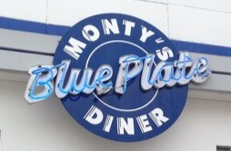
Situated across the street from the Barrymore Theatre, Monty’s Blue Plate Diner creates an atmosphere that transports its customers back in time. Its neon-lit sign is reminiscent of the 60s. At the same time, this extra illumination exposes the diner’s outside seating space, blue and white table sets. When the Barrymore marquee is lit up, the neon on Monty’s sign still attracts the eye of passersby. This sign is also unique because it’s made to look like its namesake, a blue plate. The signage choice here exemplifies what you will experience once you’re inside, as the major color scheme for the diner is blue and white.
Little Free Library

Little Free Libraries can be found scattered all across Madison and other cities across the United States. In fact, the first Little Free Library started in Madison! They don’t all look the same, but they have one thing in common: the recognizable ink that reads “Little Free Library.” Since there is a need for consistency in branding, the lettering is done in ink. This is because each library is stamped with its title. Regardless of how your own Little Free Library looks, they are all held together by the same title, down to its color, typography, and placement on wood.
Star Food Shop

While the actual Star Food Shop no longer exists, a ghost sign calls on a forgotten time in the Atwood neighborhood. Known nowadays as the Star Liquor Store, this brick building is situated on the corner of a prominent intersection. It is likely that the original food shop commissioned an advertisement to be painted on the side of the building to draw in people that were traveling by. By using white lettering on black and navy blue backgrounds, the words probably appeared very crisp against its brick backdrop in its prime. Over time, it has taken on a distressed look.
The Green Owl

The Green Owl signage was different than other signs I ran into since it was a silhouette piece, where others were not. In doing so, the restaurant’s name is less likely to incur wear and tear from the weather. In addition, sign upkeep is fairly straightforward, since the material it’s made from is painted metal. The orange of the building peeks through, making the name stand out. When night falls, the sign is illuminated with lights, casting a distinctly branded shadow against the building. This was one of the original businesses to make up the Atwood neighborhood as it is known in the present day.
I chose the locations and signs that I did for a few different reasons. The Barrymore Theatre was my first choice to include because, without it, the Atwood neighborhood would not have the cultural pull that it does. Businesses rely on theatre patrons to enjoy food and drinks before and after the shows. Over the decades, this area of Madison has gone through many changes, but the one thing that remained consistent was the theatre.
The Green Owl was a key choice as well. While it wasn't nearly as old as the Barrymore Theatre, it was one of the first businesses to take a chance on the neighborhood. At the time of purchase, there was little more to Atwood Avenue than Monty's Blue Plate Diner and a bar up the street, called Alchemy.
The Free Little Libray isn't necessarily unique to the Atwood neighborhood, but it is unique to Madison as a whole. The Free Little Library was founded in Madison and has expanded to far beyond its borders. To say this is a piece of Madison is an understatement.
Lastly, Monty's Blue Plate Diner is an important part of this neighborhood. Its neon signage ties in with other businesses in the area, including Tubb's Taco Palace. Its retro feel also pays homage to the community of yesteryear, when the Barrymore Theatre was known as the Eastwood Theatre, and traffic didn't exist.
Final Thoughts
I learned a LOT about the Atwood/Schenk neighborhood that I would've never learned if I passed by these signs without a second thought. Any time I walk down Atwood Avenue, I'll remember that there was a time when there wasn't much more there than the State Bank and the theatre. This area was popular amongst industrial businesses, which is why the Madison Candy Company got its start there. Nowadays, it's actively being transformed into an up and coming neighborhood, with amenities like restaurants, gyms, and other forms of entertainment.
As for ghost signs? Well, I'll be sure to keep looking up. Maybe something unexpected will catch my eye.
SOURCES:
BAINES, Phil and Catherine DIXON. 2008. Signs: Lettering in the Environment. London: Laurence King Pub.
CYNTHIA LEA HAAS and Jeff HOLDER. 1997. Ghost Signs of Arkansas. Fayetteville, Ar.: University Of Arkansas Press.
ENGLE, Jeanne. 2019. “Madison Candy Company.” madisonessentials.com [online]. Available at: https://madisonessentials.com/Article/2019-01/Madison-Candy#:~:text=Madison%20Candy%20Company%20was%20founded [accessed 2 Feb 2021].
FOX, Randy. 2012. “PHOTOS: The Disappearing Ghost Signs of the Rust Belt.” HuffPost [online]. Available at: https://www.huffpost.com/entry/ghost-signs-of-the-rust-belt_b_2090349 [accessed 2 Feb 2021].
GALL, David. 2012. “Ghost Signs Live Again.” Preserve Historic Forsyth [online]. Available at: http://www.preservehistoricforsyth.onefireplace.org/Resources/Documents/TPIPdec2012.pdf [accessed 29 Jan 2021].
HUSTWIT, Gary. 2015. “A Rare Interview with Graphic Design Legend Massimo Vignelli.” Fast Company [online]. Available at: https://www.fastcompany.com/3044133/a-rare-interview-with-graphic-design-legend-massimo-vignelli [accessed 27 Jan 2021].
NEWMAN, Judy. 2016. “Schenk-Atwood-Starkweather-Yahara Neighborhood: ‘like Willy Street, Grown Up.’” madison.com [online]. Available at: https://madison.com/wsj/news/local/neighborhoods/schenk-atwood-starkweather-yahara-neighborhood-like-willy-street-grown-up/article_5dea960f-8b4f-5d5d-8942-3ad536a877c3.html [accessed 1 Feb 2021].
PASSIKOFF, Ben and James TRAGER. 2017. The Writing on the Wall : Rediscovering New York City’s “Ghost Signs.” New York, N.Y.: Skyhorse Publishing.
R ALEXANDER BENTLEY, Michael J O’BRIEN and John MAEDA. 2017. The Acceleration of Cultural Change : From Ancestors to Algorithms. Cambridge, Massachusetts: The Mit Press.
SCHUTT, Stefan, Sam ROBERTS and Leanne WHITE. 2017. Advertising and Public Memory : Social, Cultural and Historical Perspectives on Ghost Signs. New York: Routledge. TIMES, Lindsay Christians | The Capital. 2013. “Ghost Signs on Willy Street and beyond Document Madison’s Industrial Past.” madison.com [online]. Available at: https://madison.com/ct/news/local/city-life/ghost-signs-on-willy-street-and-beyond-document-madison-s/article_fa60ec1e-45fd-5955-9c5a-2a8bb36dc6e4.html [accessed 2 Feb 2021].
WILD, Lorraine and Lewis BLACKWELL. 2000. Edward Fella : Letters on America : Photographs and Lettering. London: Laurence King.


Comments